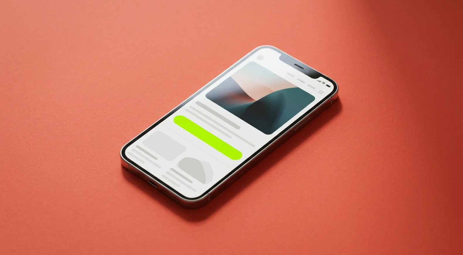
Plenty of small brands put off video ads because they picture a crew, a studio and a budget to match. For short-form placements such as Reels, TikTok and Stories, that picture is often out of date. A good share of the ads in your own feed were probably built from product photos, phone footage and on-screen text, edited tightly.
The material you already have is frequently enough. What matters more is how it is put together: what happens in the first two seconds, whether the ad makes sense with the sound off, whether it fits the format it appears in, and whether you give yourself a few versions to compare.
This guide covers each of those points, and finishes with a simple structure you can use for your next ad.
What you can build from material you already have
Before planning anything new, gather what exists. Most product businesses have more usable material than they realise.
- Product photos. Clean packshots and lifestyle images can be animated with slow zooms, pans, cut-outs and layered text. A sequence of three or four strong images with some movement can carry a short ad.
- Existing clips. Phone videos of packing orders, making the product, unboxing it or using it. Shaky footage can often be stabilised, trimmed and colour-corrected into something usable.
- Customer content. Videos or photos customers have shared can work well, but only with their explicit permission to use them in ads. Ask in writing and keep the record.
- Screen recordings. For apps, online tools and digital products, a recording of the product in use is often the clearest demonstration available.
- Licensed stock. Stock footage can set a scene or show a use context you cannot film yourself. Read the licence terms for each clip, since some licences exclude advertising or particular types of use.
- Motion graphics. Animated text, shapes, icons and simple diagrams can explain a feature, walk through how something works step by step, or give the whole ad its structure.
Imagine a hypothetical ceramics shop with a folder of product photos and a few phone clips of the glazing process. That is enough raw material for several short ads: one built around the making process, one around the finished pieces on a dinner table, and one around a single detail such as the texture of the glaze.
The first two seconds
In a fast-moving feed, the opening has one job: give the viewer a reason to stop scrolling. A slow logo animation or a wide establishing shot tends to waste that moment. Lead with something visually interesting that is relevant to the person you want to reach.
Hooks that work without filming anything new:
- The product in motion. Pouring, opening, folding, switching on. Movement in the first frame tends to catch the eye.
- The problem, shown. A tangle of cables, a cluttered shelf, a cup of coffee gone cold. Viewers who live with that problem tend to recognise it quickly.
- A direct line of text. A short, specific statement or question on screen from the very first frame, ideally naming the situation your customer is in.
- An unusual detail. A close-up texture, an unexpected angle or a surprising use of the product.
Keep the first line of on-screen text short enough to read in a glance. Whatever you claim in that line has to be true and something you can support. Some product categories also have specific advertising restrictions, so check the platform's ad policies before you publish, and ask a qualified professional if you are unsure whether a claim is allowed.
Captions for sound-off viewing
Many people scroll with the sound off at least some of the time, on a train, at work or late at night. An ad that depends on its voiceover loses them. Design every ad so it makes sense on mute:
- Burn captions into the video for any voiceover or speech, rather than relying on automatic subtitles that viewers may have switched off.
- Use on-screen text to carry the main message, with one idea per screen.
- Keep text large and high in contrast, with a solid or semi-transparent background behind it if the footage is busy.
- Leave each line on screen long enough to read twice without rushing.
- Keep text away from the edges, where the platform places buttons, captions and profile details.
Sound still matters for viewers who have it on. Any music you use must be licensed for advertising. Tracks that are available inside a social app are not always cleared for paid ads, so check the licence terms, or use a music library whose licence explicitly covers commercial use.

Formats: 9:16, 1:1 and 16:9
The same ad usually needs to exist in more than one shape. The main ones look like this:
| Format | Where it tends to appear | Notes |
|---|---|---|
| 9:16 vertical | Reels, TikTok, Stories | Fills the phone screen, keep key content in the central area |
| 1:1 square | Feeds on several platforms | Works in many placements, less immersive |
| 16:9 horizontal | YouTube, websites, some in-stream placements | Suits longer demos, appears small on a phone |
Many advertisers also make a 4:5 version for feeds, since it takes up more of the screen than a square.
The practical approach is to plan for vertical first, because that is where short-form placements live, and to keep the important elements (product, text, logo) within a central safe area. The edit can then be adapted to square and horizontal versions by reframing rather than rebuilding from scratch. Check each platform's current specifications before exporting, as recommended sizes and safe zones change from time to time.
A simple structure for a 15-second ad
If you are starting from a blank timeline, this order is a sensible place to begin:
- Hook, 0 to 2 seconds. Movement, a visible problem or a direct line of text.
- Context, 2 to 5 seconds. Who this is for, or the situation it helps with.
- Product in action, 5 to 10 seconds. Show it being used, opened or worn. Close-ups help.
- A concrete detail, 10 to 13 seconds. Material, size, what is in the box, how it is delivered. Specific facts tend to persuade more than adjectives.
- Offer and next step, 13 to 15 seconds. What to do next, in a few words, with the product still on screen.
The timings are rough guides. Some ads work better at six seconds and some at thirty. The order matters more than the exact length.
Testing a few variants
Video ads are hard to judge in advance, even for people who make them every day. Instead of polishing one version for weeks, make a small set and let the results guide you. Three or four variants are a manageable number for a modest budget.
The important rule is to change one element at a time. If every variant has a different hook, different music and a different offer, you will not know which change made the difference. A sensible order for testing:
- Hooks first, since the opening decides whether anything else gets seen.
- Then the main message or angle.
- Then the format or the length.
Give each variant enough time and spend to allow a fair comparison before deciding. What counts as enough depends on your budget and the platform, so resist judging after a single day. Keep a simple log with the variant name, what changed, the dates and the numbers you care about. Over a few months, that log becomes a record of what your audience responds to, which is more useful than any single ad.
Everglow's Video Ad deliverable works in exactly this way, edited from your footage, product photos, licensed stock or motion graphics, with no shoot involved, at a fixed price. Whether you make your own or hand it over, the structure above is a good starting point.
This article is general information, not professional advice for your business. Examples use hypothetical brands. See our Results Disclaimer.